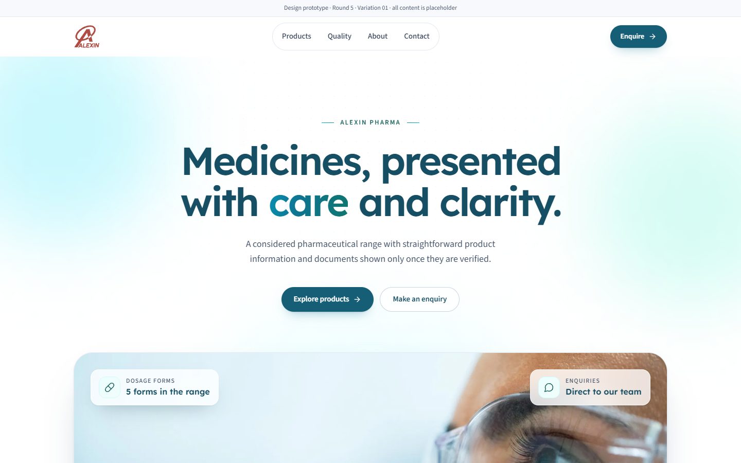
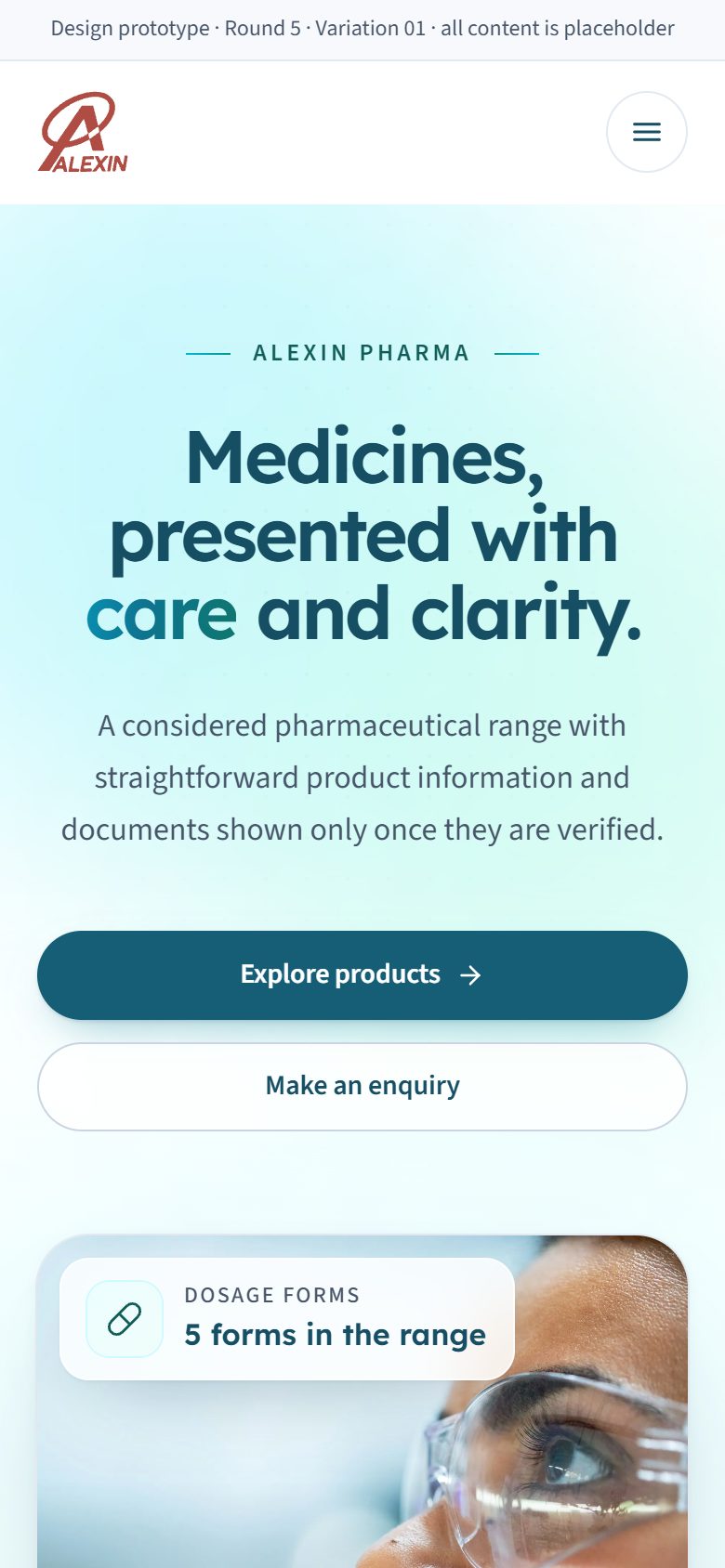
Variation 01 · Lexend + Source Sans 3
Classic clinical white
A centred headline and one large photograph. The most conventional and restrained of the five.
Open variation 01
Stage 1 · Round 5 · Beautiful simplicity
Awaiting client selection
Round 4 was clean but too plain. Round 5 keeps each layout's simplicity, ui-ux-pro-max palette and font pairing, and adds craft: layered heroes with floating glass cards and packs on pedestals, soft aurora gradients and fine line-art textures, photo-led category cards, a photo statement band, about collages, refined seal badges, a gradient call-to-action band, a navy footer and gentle micro-interactions. There is still no 3D and no heavy motion.
A centred headline and one large photograph. The most conventional and restrained of the five.
Open variation 01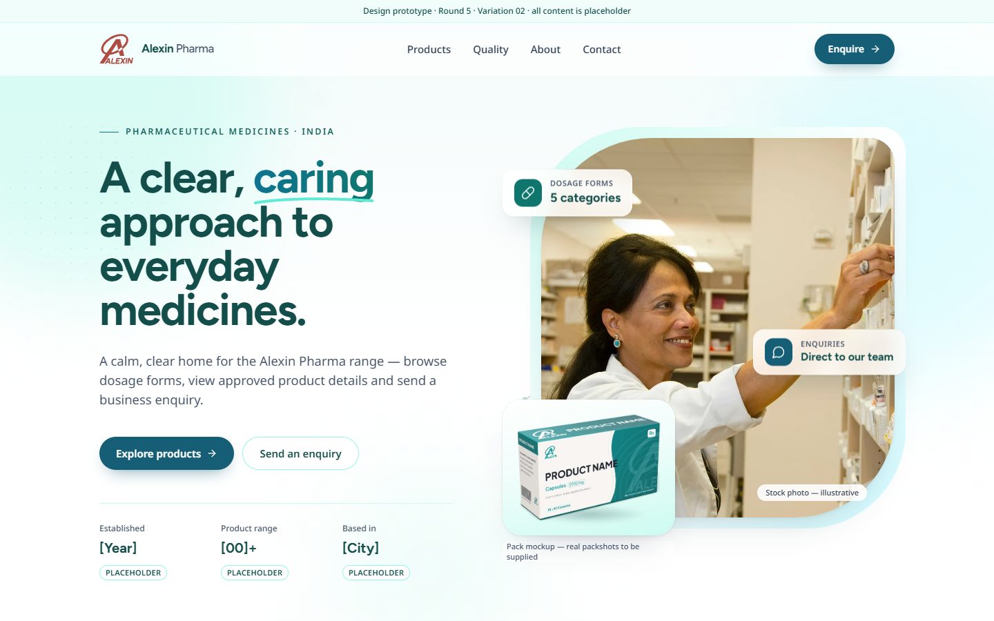
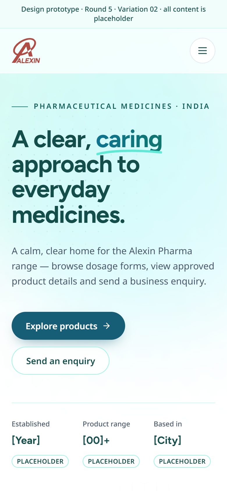
Text on the left and a photo on the right in a soft teal panel. Friendly and modern.
Open variation 02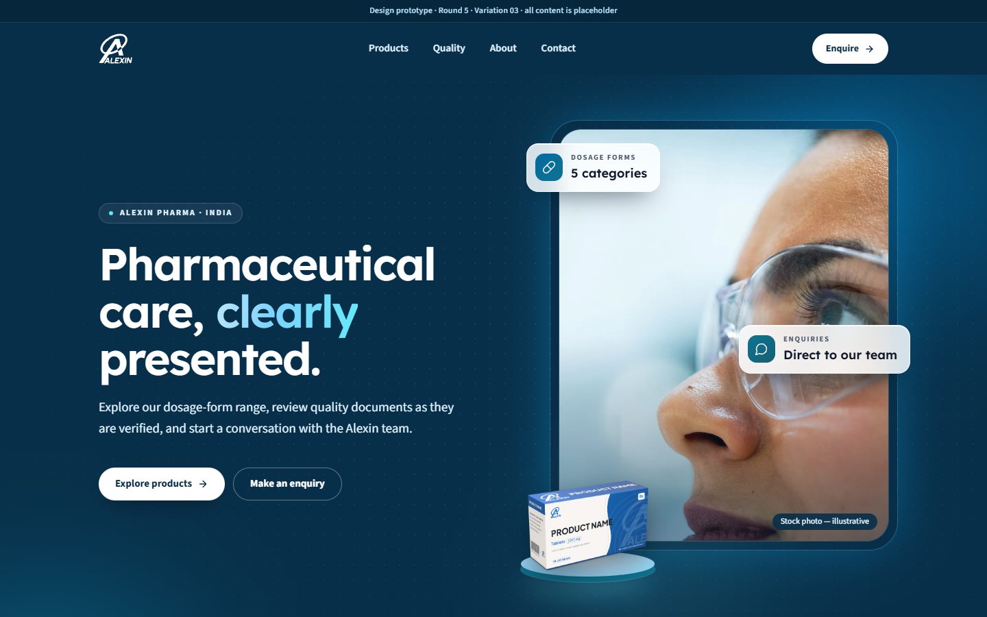
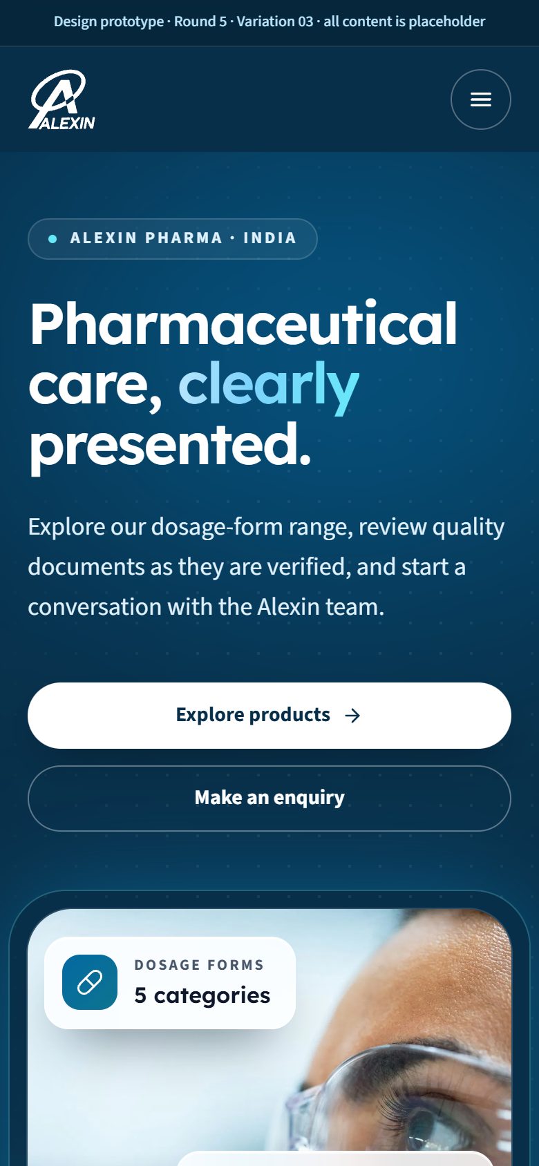
An authoritative navy band at the top, white content below and a navy footer. A corporate feel.
Open variation 03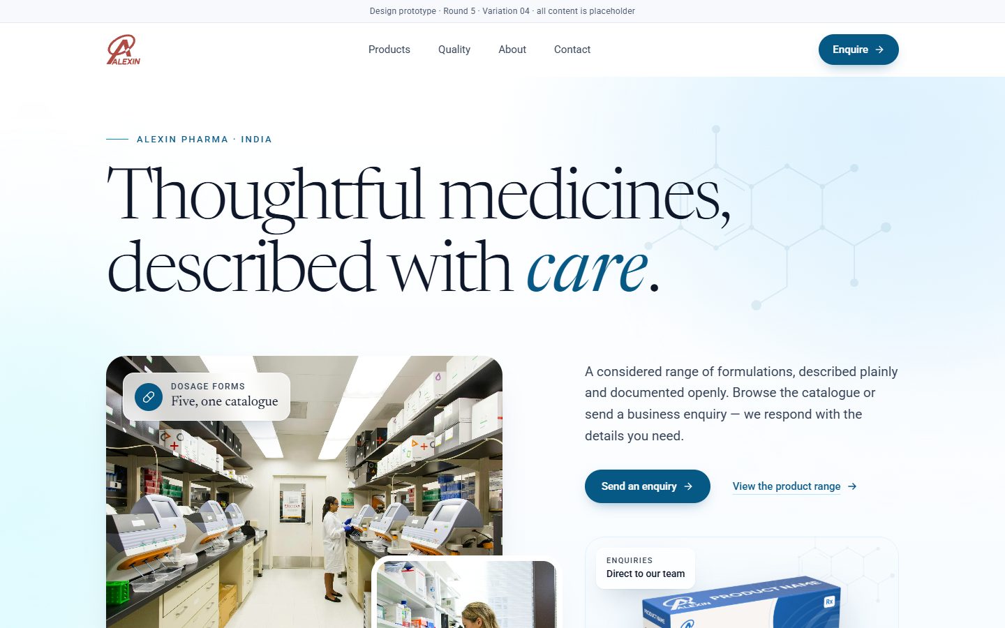
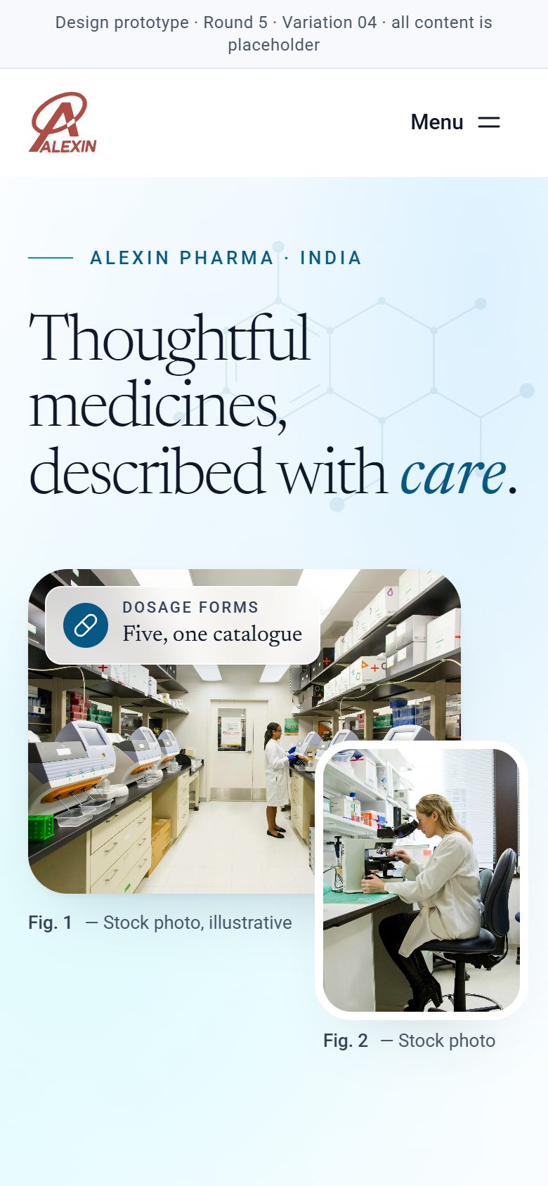
Large, calm type and an airy grid, in the style of a premium healthcare annual report.
Open variation 04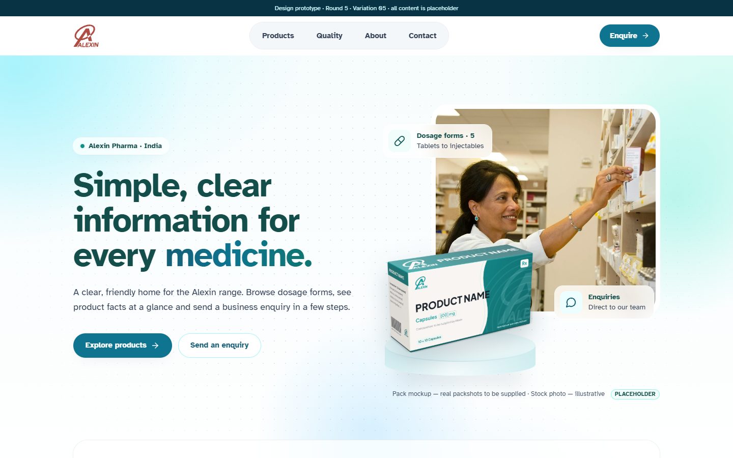
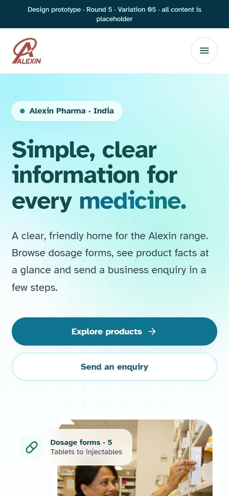
A very pale gradient and rounded cards. Approachable but still clinical.
Open variation 05